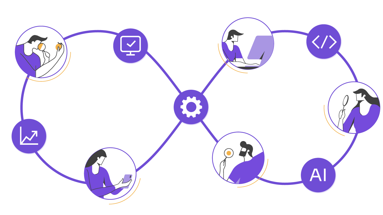
5 accessibility heuristic principles to improve UX, avoid common mistakes, and meet compliance. Includes FAQs for decision makers driving AI-driven, scalable solutions.

Accessibility heuristic principles can help you improve user experience from the start. At Abstracta, we use each heuristic to detect usability risks early, strengthen user interfaces, and build more inclusive solutions. It’s part of how we design and test with quality in mind.
Apply these principles during the design process and you’ll reduce accessibility issues, prevent rework, and support real people—not just compliance checklists.
1. Flexible User Control
Provide Flexible User Control in Every Interaction
Problem:
Rigid interfaces limit how users interact, especially those using assistive tech.
Solution:
Support device-independent interaction. Let users pause, review, and control the experience using their preferred input—keyboard, voice, or others.
Why it matters:
This accessibility heuristic helps people with motor or cognitive challenges interact smoothly. And it improves UX for everyone.
Example:
A form that submits as soon as you stop typing removes control. A better design waits for the user to review and confirm.
2. Error Prevention and Feedback
Prevent Errors With Clear Feedback and Error Messages
Problem:
Users often don’t know what went wrong or how to fix it. This leads to frustration, drop-offs, and accessibility barriers.
Solution:
Use this accessibility heuristic to guide how you handle errors. Provide clear, descriptive error messages in plain language. Make sure feedback is timely, visible, and helps users recover smoothly.
Why it matters:
Preventing errors—or helping users correct them without stress—is essential for accessible design. It also improves trust and reduces support costs.
Example:
Instead of showing “Invalid input,” tell the user: “Please enter a valid email address (e.g., [email protected]).” That one line can be the difference between staying and leaving.
3. Alternative Equivalents for Non-Text Content
Support Alternative Equivalents for Visual and Auditory Content
Problem:
If content relies only on visuals or sound, many users miss key information, particularly those with visual or hearing impairments.
Solution:
Use this accessibility heuristic to include meaningful alternative equivalents. Add text-based alternatives for images, icons, audio, and video. These alternatives should convey the same purpose, not just a description.
Why it matters:
When alternatives are clear and consistent, content becomes usable by more people—across devices, agents, and contexts. It also helps with SEO and compliance with web content accessibility guidelines.
Example:
An icon-only button may confuse some users. Adding a text label like “Save” or “Download report” helps clarify the function, even without visuals.
4. Logical and Predictable Structure
Design Interfaces With Natural and Logical Order
Problem:
When content is out of order or inconsistent, users struggle to navigate and understand key actions.
Solution:
Apply this accessibility heuristic to organize content in a way that reflects a natural and logical order. Group related elements, follow familiar patterns, and make navigation predictable from one page or screen to the next.
Why it matters:
This reduces cognitive load and helps users efficiently interact with your system. It also supports screen readers and aligns with web content accessibility guidelines.
Example:
A checkout form that asks for payment info before contact details can confuse users. A logical flow—email → shipping → payment—keeps the process clear.
5. Reusable Components and Patterns
Use Reusable Components to Scale Accessible Design
Problem:
When accessibility is handled case by case, teams waste time fixing the same issues. Inconsistent patterns slip into production and create new accessibility bugs.
Solution:
Create reusable UI components with accessibility built in—keyboard support, clear roles, alternative equivalents—and use them consistently. At Abstracta, we go further by integrating AI-driven solutionsthat analyze codebases, detect accessibility issues at scale, and help developers apply accessibility heuristics across systems.
Why it matters:
This accessibility heuristic is about more than saving time; it helps build a culture of accessibility into your design process. AI-driven insights help teams catch issues early and promote accessible, testable, and maintainable interfaces.
Example:
A design system that includes an accessible button, modal, and input field—with AI validation hooks—saves time and helps uphold quality as products evolve.
Quick Summary: 5 Accessibility Heuristics That Matter
| Heuristic | What It Improves | Abstracta’s Focus |
|---|---|---|
| Flexible User Control | Reduces friction and supports methods for multiple interactions | We validate interaction across input types |
| Error Prevention and Feedback | Helps users recover and complete tasks | We test for clarity in messaging and flow |
| Alternative Equivalents | Makes content accessible to all, including people with disabilities or temporary and situational limitations. | We promote consistency across media and formats |
| Logical and Predictable Structure | Improves comprehension and navigation | We audit the structure and flow across user journeys |
| Reusable Components and Patterns | Scales accessibility efficiently | We apply AI-driven solutions to reinforce accessible design patterns |
Why These 5 Accessibility Heuristics?
There’s no single, universal set of accessibility heuristics—but over the years, researchers, designers, and accessibility experts have developed principles to guide inclusive user interface design. For this list, we selected five accessibility heuristic principles that:
- Apply across design, development, and testing workflows
- Solve real barriers that impact autonomy, clarity, and control
- Align with the Web Content Accessibility Guidelines (WCAG) and core usability heuristics
- Can be supported and scaled using AI-driven solutions
- Reflect our hands-on experience at Abstracta, working with teams committed to accessibility and quality
These principles are not the only ones that matter, but they’re some of the most powerful starting points if you want to improve UX and reduce accessibility issues from the start.
Ready to Put These Heuristics Into Action?
At Abstracta, we help teams apply each accessibility heuristic through accessibility testing, inclusive design, and AI-driven solutions that scale. Whether you’re just starting or need to go deeper, we’re here to support your next move toward better UX for real people.
Book a meeting. Let’s talk about your accessibility goals.
Common Mistakes When Applying Accessibility Heuristics
1. Failing to Provide User Control From the Start
Many interfaces override user preferences—auto-playing media, disabling pause options, or requiring fast responses. This breaks the principle of providing user control and severely limits flexibility.
Fix it:
Provide device-independent interaction and allow users to choose their preferred input method. These decisions benefit both new and experienced users, and align with general principles of inclusive design. When you conduct heuristic evaluations early, you’re more likely to uncover where flexibility is lacking.
2. Using Errors and Error Messages That Confuse Users
Unclear or generic error messages create frustration and abandonment. Users don’t always know what went wrong or how to fix it.
Fix it:
Write appropriate feedback using plain language and examples. Anticipate friction points and design flows that prevent mistakes. This gives users confidence and improves clarity throughout your website content.
3. Ignoring Visual Design and Semantics in Key Elements
Poor visual design, inconsistent layout, or missing roles make interfaces harder to navigate, especially for screen readers.
Fix it:
Provide semantics using proper markup, and ensure that the same elements behave consistently. Use a structure that helps users stay oriented and makes sections easily distinguished without relying solely on vision.
4. Overcomplicating Content With Jargon or Graphics Language
Complex graphics languages and technical jargon can overwhelm users, especially when paired with poor icon labeling. This creates confusion instead of clarity.
Fix it:
Use meaningful instructions and concepts familiar to your audience. Avoid graphics-related language designers might love but that users recognize less reliably. Use users’ language: familiar, inclusive, and focused on intent. This reduces cognitive load and supports accessibility for all.
5. Skipping Contextual Clarity for Key Information
Without visible feedback or guidance, users are left guessing. Many interfaces fail to offer relevant information or fail to show how each element relates to the user’s action.
Fix it:
Keep users informed at every step. Surface useful signals for system status, write contextual help, and constructively suggest next steps. The result is a smoother experience that respects the user’s time and attention.
6. Designing Without Navigation Alternatives or Equivalents
If users can’t easily navigate content or access equivalent content, the experience excludes them. This applies to both simple pages and specialized multimedia components.
Fix it:
Provide alternative equivalents for all visuals and audio. Offer alternative ways to complete actions and support diverse presentation users and user agents.
7. Not Reusing Proven Patterns and Components
Starting from scratch every time leads to inconsistent behavior and repeated accessibility bugs. Many teams miss the opportunity to apply known solutions.
Fix it:
Provide reusable components with accessibility built in. These speed up dev cycles, address core demands for consistency, and help build better user interfaces. Use control alternative equivalents within components to reduce rework, and leverage your design system’s explanatory power to make accessibility predictable and scalable.
8. Overloading Interfaces Without Filtering Meaningful Information
Some interfaces flood users with choices, redundant text, or low-value content. This overwhelms instead of empowering, especially when cognitive load is already high.
Fix it:
Prioritize meaningful information that directly supports user tasks. Present a reasonable amount per screen and offer visual and auditory alternatives where appropriate. This helps all users to act confidently and efficiently.
9. Missing the Opportunity to Provide Users with Mental Shortcuts
When every step requires conscious effort, users become fatigued or drop off. This happens when patterns aren’t leveraged or intuitive defaults are missing.
Fix it:
Provide users with familiar flows and mental shortcuts that reduce friction. Support multiple interactions while keeping concepts clear. Anticipate expectations based on previous experiences to streamline use and reduce abandonment.
Ready to avoid these common mistakes?
We can help you apply accessibility heuristics effectively—before issues reach production.
Let’s talk.
FAQs about Accessibility Heuristics

What Is an Accessibility Heuristic?
An accessibility heuristic is a principle used to evaluate whether a digital product supports inclusion for users with disabilities or situational limitations. It helps identify accessibility issues during the design process, guiding better decisions in areas like user control, error messages, and alternative equivalents.
How Do Heuristic Evaluations Help Improve Accessibility?
A heuristic evaluation helps teams detect accessibility and usability barriers early, without relying solely on user testing. It supports consistent user interfaces, highlights poor error prevention, and enables elements to follow a natural and logical order—crucial for people with cognitive disabilities.
What’s the Difference Between Accessibility Heuristics and Usability Heuristics?
While both types of heuristics aim to improve UX, accessibility heuristics focus on removing barriers for users with disabilities. Usability heuristics improve general interactions, while accessibility heuristics help make those interactions possible using different interaction methods, like screen readers or device-independent interaction.
What Accessibility Issues Should I Prioritize First?
Start with areas that affect most users: lack of alternative equivalents (e.g., missing image descriptions), limited user control, poor error messages, and inflexible navigation. These often relate to the absence of reusable components or inconsistent application of accessibility heuristics during the UX design phase.
How Do AI-Driven Solutions Improve Accessibility Testing?
AI-driven solutions speed up accessibility testing by scanning for missing alternative equivalents, checking for reusable components, and analyzing user navigation flows. They help identify gaps early, align with web content accessibility guidelines, and support both technical and design teams without replacing manual review.
When Should Accessibility Heuristics Be Applied in the Design Process?
Apply accessibility heuristics from the start of the design process. Early integration reduces cost, prevents mistakes, and supports accessible presentation and input methods. This also helps designers create reusable components that meet accessibility standards across platforms.
Why Should Decision Makers Care About Accessibility Heuristics?
Because accessibility isn’t just about compliance—it’s about reach, performance, and resilience. Applying each accessibility heuristic strengthens product quality, reduces risk, and increases adoption across more users, devices, and user agents. It’s a strategic investment in inclusive growth.
What’s the Relationship Between Accessibility Heuristics and WCAG?
Accessibility heuristics are high-level principles that help teams design and test more inclusive interfaces. The WCAG (Web Content Accessibility Guidelines) provides detailed success criteria and technical specifications. Together, they guide better decisions, from conceptual design to compliance-ready products.
How We Can Help You
With over 17 years of experience and a global presence, Abstracta is a leading technology solutions company with offices in the United States, Chile, Colombia, and Uruguay. We specialize in software development, AI-driven innovations & copilots, and end-to-end software testing services.
We believe that actively bonding ties propels us further and helps us enhance our clients’ software. That’s why we’ve built robust partnerships with industry leaders Microsoft, Datadog, Tricentis,
Perforce BlazeMeter, Saucelabs, and PractiTest to provide the latest in cutting-edge technology.
Our holistic approach enables us to support you across the entire software development life cycle—from UX design and accessibility evaluations to AI-powered quality solutions.
Looking to Apply Accessibility Heuristics?
Let us support your journey with tailored solutions and strategic testing.
Contact us!

Follow us on Linkedin & X to be part of our community!
Recommended for You
Testing Generative AI Applications