Making sure your app’s design doesn’t alienate users, whether they have physical disabilities or not
You have just developed your app and it looks extremely beautiful and sleek with all the bells and whistles! Woohoo! Everyone is going to love it right?
Well, first it’s important to review if it is indeed well designed for as many users as possible. Can your grandma figure out how it works? Is it easy to use when you only have one hand available? Is it compatible with support products for the blind, deaf, etc?
[tweet_box design=”default” float=”none”]Plain and simple, accessible design is good mobile UI design.[/tweet_box]
In this post, we will examine some concrete examples of good and bad UI design that address the needs of people with certain physical disabilities.
How Do People with Disabilities Interact with Mobile Apps?
Firstly, it is important to discuss just how do people with disabilities use mobile applications and overcome their challenges in using them that the rest of the population doesn’t face. Many times they rely on special support products, therefore it’s important to keep them in mind when designing an app to make sure that it works well alongside them. Below we’ll cover some of those products.
For the Visually Impaired:
- TalkBack (Android) and Narrator (Windows): Read the current screen’s content
- VoiceOver (iOS): Tells you out loud what is in the touch area
- Zoom (Android, iOS, and Windows): Works like a magnifying glass, allowing you to enlarge content on the screen using touch gestures
- Dictation (iOS and Android): Allows the user to input text by his or her voice
For the Hearing Impaired:
- Subtitle (Android and iOS): Allows you to add and display subtitles for multimedia content
- Visible and vibrating alerts (Android and iOS): Allows the user to be aware of alerts and messages through lights and vibrating notifications instead of sounds
For Those with Impaired Motor Skills:
- Switch Access for Android and Switch Control for iOS: Allow you to navigate the screen by sequentially highlighting items and use a physical switch to select them
- AssistiveTouch (iOS): Allows you to configure multiple gestures, according to the user’s needs
Tip: The accessibility API in iOS and Android provides a set of libraries for developers to create applications that leverage these phone support products.
We will now break down six examples of good and bad accessible mobile UI design, categorizing them by the 4 principles of mobile accessibility (outlined by the W3C): perceptibility, operability, understandability, and robustness.
Examples 1&2: Perceptibility
This principle relates to the visibility of the elements in an application. It takes into account how information should be displayed regarding the size of the screen when the zoom action is performed or when the font size or contrast changes. Besides having images that represent an option or functionality, it is a must to have a compatible text alternative within the accessibility layer.
Take this example showing poor perceptibility on the left and better perceptibility on the right when the TalkBack tool is being used.
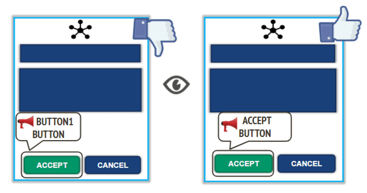
If your user is utilizing one of the tools for the visually impaired, he or she will be read aloud the elements on the screen. On the left, the description, “Button 1,” is much more confusing than the description of the button on the right.
Always ensure that a vision impaired user receives the exact same information that is available visually by adding clear, descriptive text for every visual element.
Another important aspect of an app’s perceptibility is the use of color contrast.
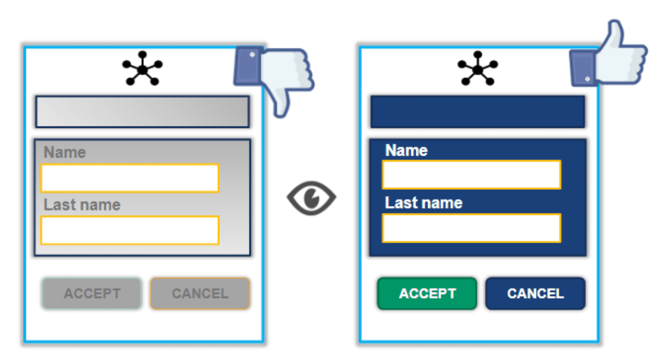
In the first image, it’s difficult to see the text options since the text is gray on a gray background.
In the second picture, the text consists of white letters on either a blue or green background, which is far easier to see.
We must take caution with the colors that we use for our texts, buttons, and backgrounds for our application. By doing this we are keeping in mind and benefiting people with partial vision so that they can easily distinguish the buttons in applications and perceive contrasts differentiating between foreground and background colors.
To validate whether or not your app has good color contrast and if it’s highly perceptible, you can use these tools:
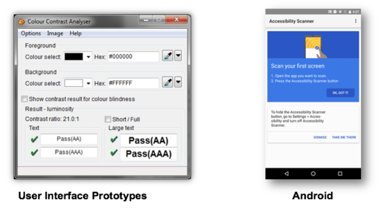
- Colour Contrast Analyser: From the UI design stage, this tool helps you know if the text legibility and contrast of visual elements are acceptable.
- Accessibility Scanner: A free app for Android launched by Google, this tool gives you suggestions for improvement for larger tactile elements, like increasing the contrast or providing descriptions so all users with accessibility needs can use the application without problems.
Example 3: Operability
This principle relates to how easy it is for a user to carry out actions, gestures, and movements on the screen. It’s important to make it obvious at all times where the user is located within the app and make it easy for them to know what they are supposed to do next at all times.
Take a look at these examples of operability:
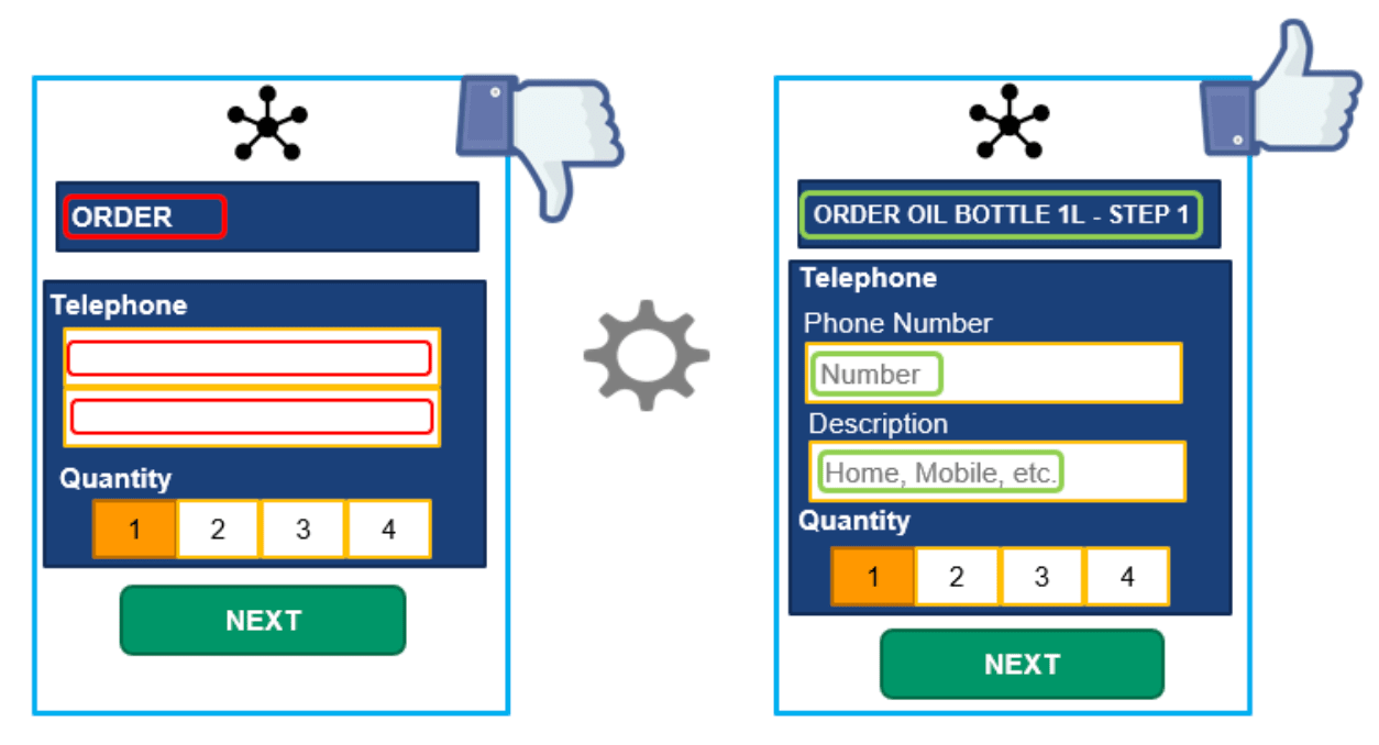
In the first image, you can see that the title screen is ORDER, a title that doesn’t indicate to a user who may have stepped away for thirty minutes or so what it was they were in the middle of ordering. It’s also not very helpful to have fields in the form that do not provide cues as to what needs to be filled out in each.
In the second picture, we see that the screen contains a more specific title: what exactly they are ordering and how far in the process they are of ordering it. In addition, text fields are displayed letting you know that you must enter your phone number and its description, like “home” or “mobile” number. With these improvements, the user is always aware of what stage of the process they are in, what they ordering, and also what exactly is the information that is being asked of him or her.
Titles for each screen and descriptions in the text fields benefit people with cognitive disabilities; users who may have difficulty understanding and assimilating information or face difficulties with interpreting the meaning of a selection or text field.
Example 4: Understandability
When speaking of an app’s “understandability” we are referring to how it adapts to changes in screen orientation. For example, does it maintain a consistent design and give us the proper cues as to how it works? Understandability, of course, also relates to the language used in notifications, instructions, buttons, etc. Everything should be clear and simple, not to mention free of grammatical errors.
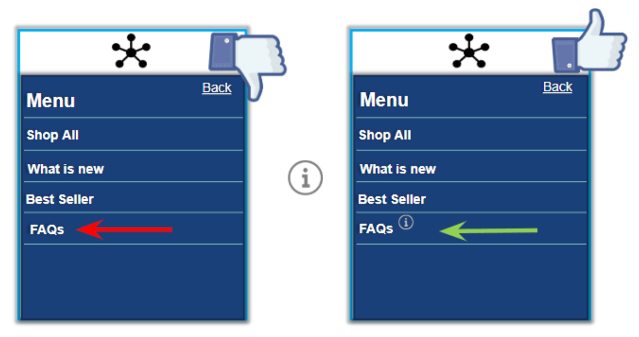
In the first image, we can see that the four menu item is called FAQs. We should be careful with abbreviations and be ensure that users can access the expanded form of abbreviations.
By fulfilling these accessibility criteria for understandability, we can benefit users who have difficulty decoding words, rely on screen magnifiers, have limited memory or have difficulty using context to aid understanding.
Example 5: Robustness
This principle is not actually directly related to the design, but as a designer, tester or developer, we can still check the behavior of the application with the use of support products.
Content must be robust enough to be interpreted reliably by support products. A highly accessible mobile application must be compatible with support products, working just as well as when you do not have an activated support product.
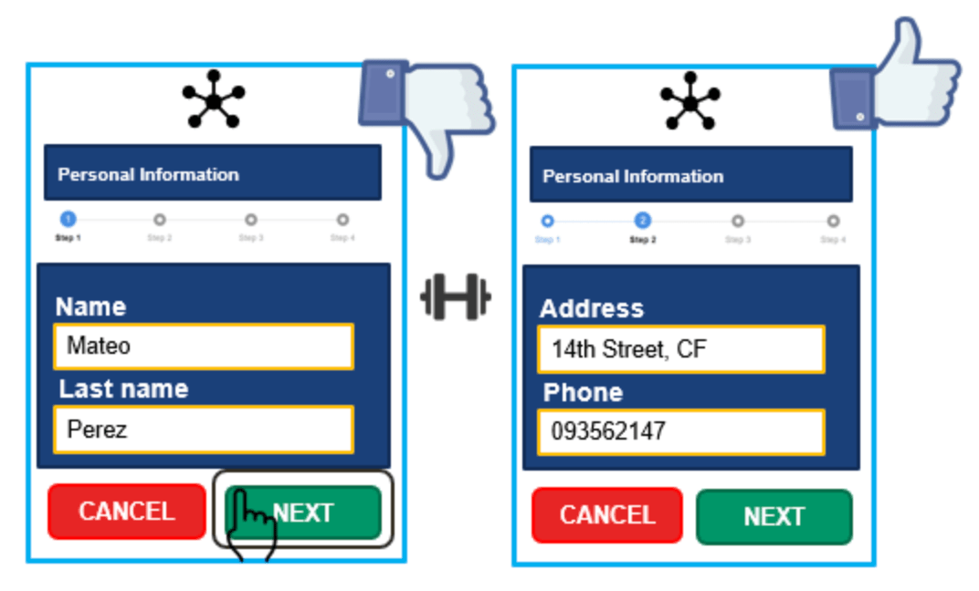
A user gives the “Next” button 3 taps
When a user has enabled VoiceOver, TalkBack, or Narrator, in order to select an option, he or she must tap once to hear what it is and then double tap in order to select it.
In the first image, we see the user doing just that. The user taps on the “Next” option and the support app indicates that it’s the “Next” option and that it’s a button. He or she then double taps it, but the app becomes unresponsive and doesn’t display the next screen. This can often happen when an app is not compatible with the support product, certain buttons and functions don’t adhere to the alternate way of using them.
On the other hand, after tapping three times, the next corresponding page appears, meaning the application is compatible with the support product and performs the action as it would when the support product is not activated.
Accessibility is Key for Good Mobile UI Design
Now you know several examples of accessible mobile UI design and hopefully, you’ll only make apps in the future that take users with physical disabilities into account. At the least, I hope you take five minutes to test your app by using these support products or accessibility testing tools in order to put yourself in the shoes of someone else.
For more resources, I recommend visiting https://www.w3.org/WAI/mobile/ and reading this: My Approach to Mobile Accessibility Testing By Helen Burge for Ministry of Testing.
Do you have any other do’s and don’ts of accessible mobile UI design to add to this list?
Recommended for You
How to Easily Do Accessibility Testing in Continuous Integration
New Software Testing Courses for People with Disabilities


