Reviewing JMeter’s new online editor
BlocklyJMX is a web-based alternative to JMeter for viewing and editing test plan files. If you aren’t familiar with JMeter, it’s an open source application designed to load test functional behavior and measure performance. Still in its early stages of development, we’ve had the chance to review the beta version of BlocklyJMX.
Below you can get a glimpse of the difference, with BlocklyJMX on top and JMeter on the bottom:
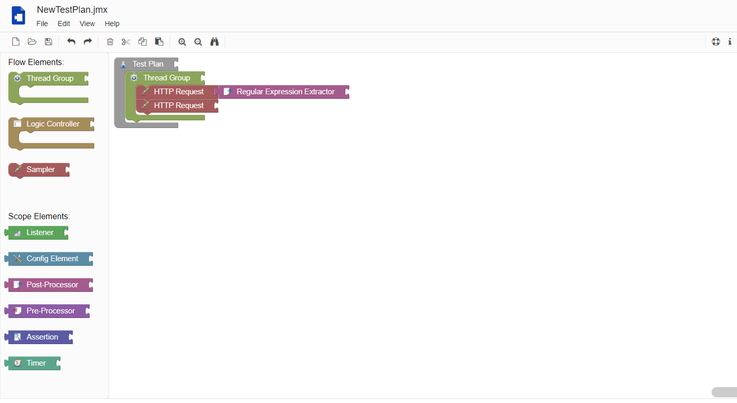

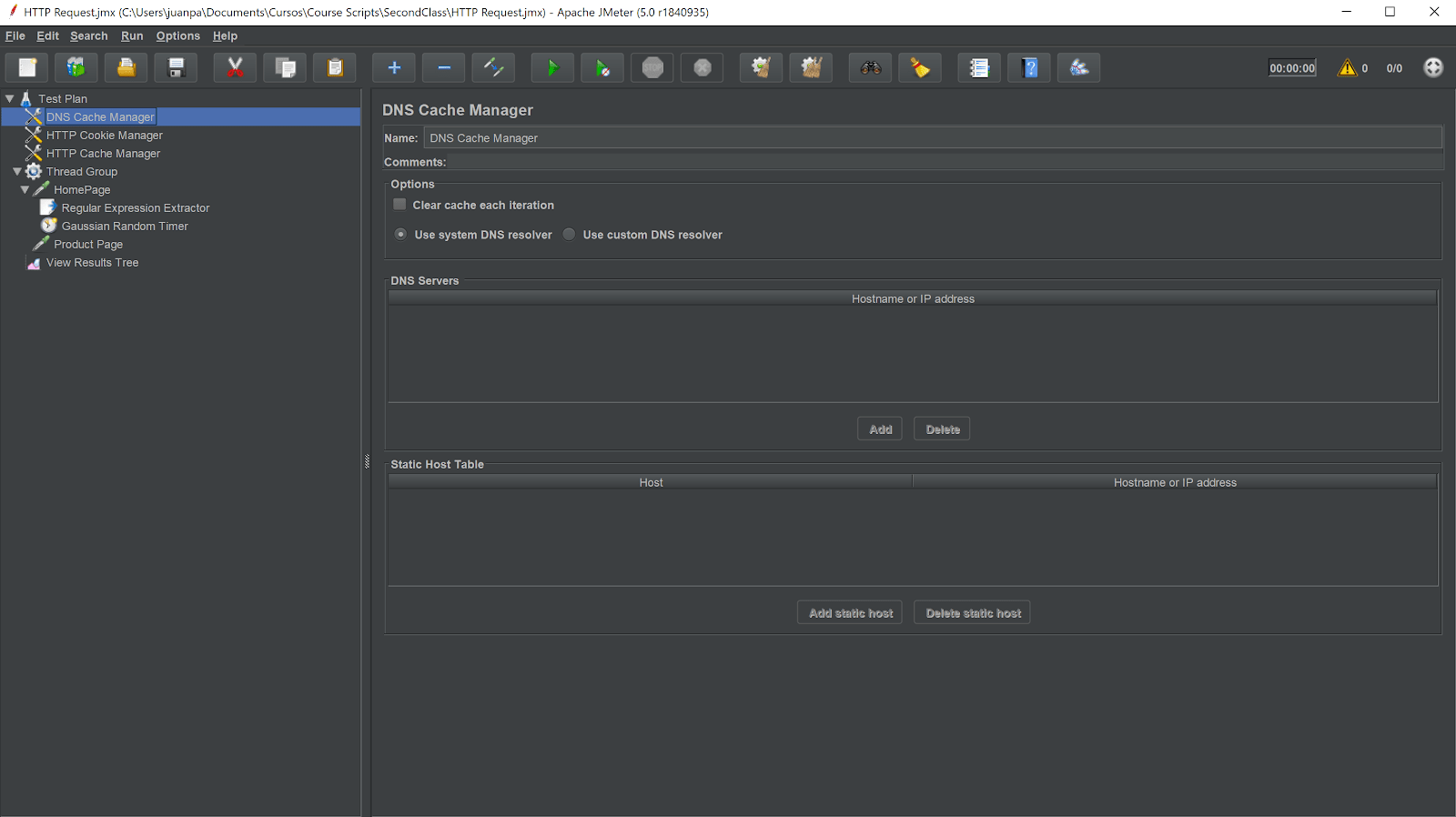

In this blog post, I’ll compare BlocklyJMX to JMeter’s UI in order to see how the two stack up against each other and I’ll take two approaches to this comparison. First, I’m going to create a script in JMeter which I’ll later recreate using BlocklyJMX, seeing if it takes me longer and how easy or difficult it is to do. Of course, it’s important to note that this won’t be a statistically correct comparison and I’ve spent considerably more time using JMeter than BlocklyJMX. Secondly, I’m going to analyze BlocklyJMX’s UI based on Nielsen’s heuristics in order to assess how intuitive and understandable the tool is.
The test case I automated for this assessment is pretty simple: visit an e-commerce website’s homepage, extract some product IDs and navigate to their detail pages. I chose this simple test case so that the flow’s complexity wouldn’t sway my opinion.
First Impressions of BlocklyJMX
From the start, I noticed several things about BlocklyJMX:
- It’s very intuitive and seems easy to use.
- It’s made using Google’s Blockly library which is inspired by Scratch. One of its objectives is to simplify the process of learning how to program by making things clearer and easier to recognize due to the visual programming paradigm it uses.
- The navbar resembles that of Google Docs and Draw.io:


Digging Deeper
After creating my test scripts, I found a few things that I would consider areas for improvement or inconveniences.
Firstly, it’s lacking the opportunity to run your script inside a sandbox, a feature which will definitely be missed since I’ve yet to meet someone who scripts without running it as they advance with their work. It’s not a difficult thing to overcome since it’s as easy as downloading the jmx file and running it using JMeter, but it’s still a mild inconvenience. A well known fact when developing anything is that it’s important to have fast and early feedback loops and this aspect adds some friction in that sense.
Another thing I noticed are that certain text fields inside components are not quite the same as in JMeter’s UI, which could lead to mistakes and mixups. Here is an example:
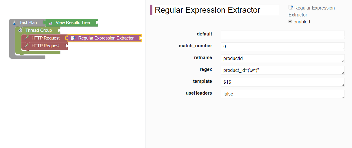

As an example, in this regex extractor component, we find that there isn’t a field labelled variable name, and instead, refname is used. Even though most input field labels have the same or a similar name to the one used in JMeter, the few that don’t might confuse other users as it did me.
Another inconvenience I encountered which might be a dealbreaker for others are some resolution scaling/responsiveness issues. The picture below showcases how the website is displayed on a 900p monitor, which makes text labels and text boxes overlap, causing it to be more difficult to distinguish what some of them say.
I’ve actually already created an issue in their support forum regarding this, so hopefully it has been solved by the time you try it.
UPDATE: Less than a week after I created the issue, the developer fixed it. This goes to show how involved they are with this tool’s support.
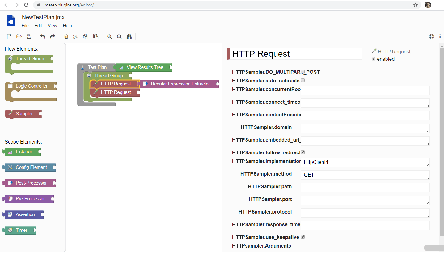

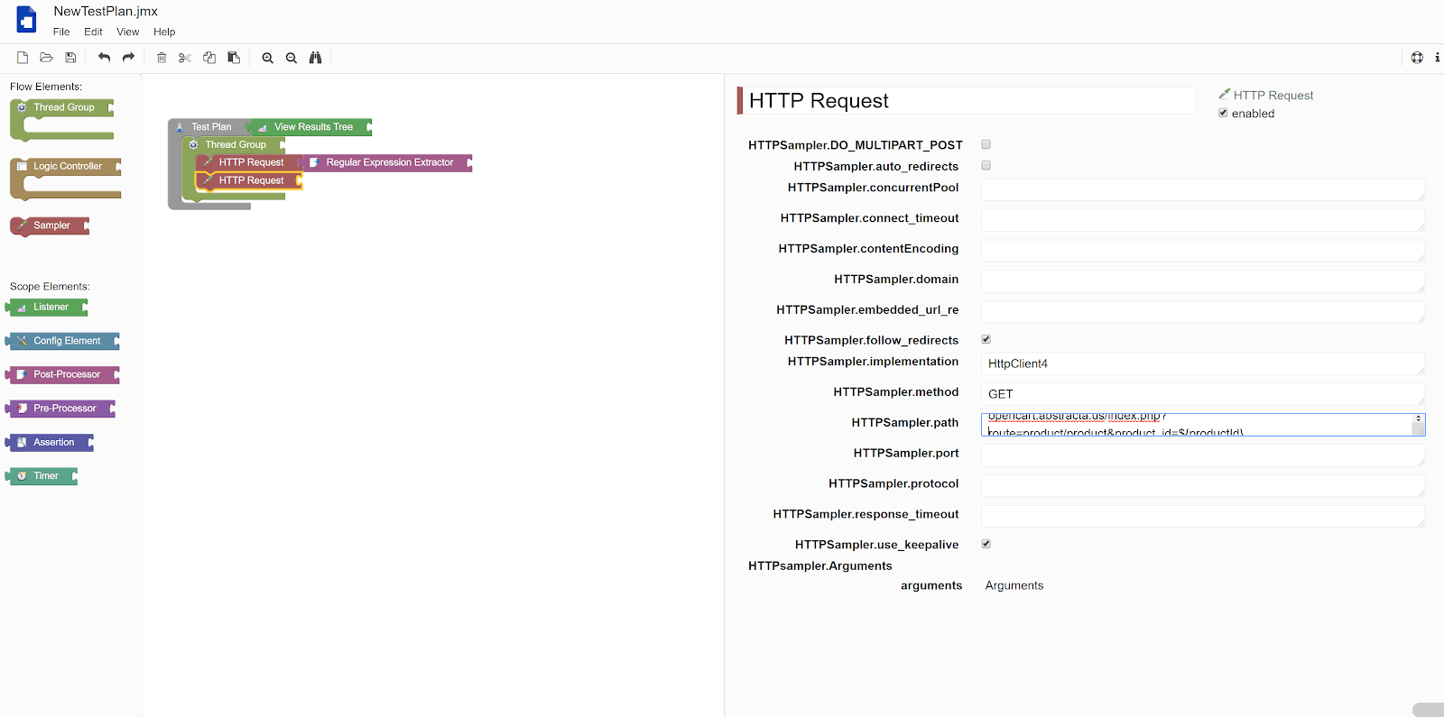
The last inconvenience I ran into was that the text fields I saw (all of them) presented vertical scrolling instead of horizontal scrolling, which isn’t really intuitive. I consider this a design choice rather than a bug, so I didn’t report it in the support forum.
Here’s an example:

Analyzing BlocklyJMX with Nielsen’s Heuristics for Usability
We thought it might be a neat idea to assess BlocklyJMX’s usability according to Nielsen’s heuristics, since it might show both its strengths and shortcomings in a more structured way.
According to this article, “Jakob Nielsen’s heuristics are probably the most-used usability heuristics for user interface design. Nielsen developed the heuristics based on work together with Rolf Molich in 1990. The final set of heuristics that are still used today were released by Nielsen in 1994.”
Visibility of System Status
“The system should always keep users informed about what is going on, through appropriate feedback within reasonable time.”
System status visibility can be split in two here. As for the header of the UI, no possible user action can have any impact whatsoever on it. What does that mean? Let me show you an example:


The look of none of those components changes no matter what you do. What I mean by that is, if I loaded a script onto the application and edited it, the save icon will not change its look to notify me that I have unsaved changes.
The same can be said about the undo and redo buttons. At the moment I took that screenshot I had made absolutely no changes to the script aside from loading it. Which means that they would have no effect, however, none of them were grayed out or anything that would suggest to me that they would have any effect. The same is true for all components in that toolbar.
On the other hand, the editor itself has better system status visibility. The clearest example can be seen in this screenshot:


The system highlights in yellow the component I’m working with on the left, so as to not mistake it for another Gaussian Random Timer inside my script in this particular case.
All in all, I think this application does not really communicate its status to the user properly, or at least not in any useful way aside from the previous example. Thus I would say it does not meet this criteria.
Match Between the System and the Real World
“The system should speak the users’ language, with words, phrases and concepts familiar to the user, rather than system-oriented terms. Follow real-world conventions, making information appear in a natural and logical order.”
This heuristic mostly touches on the subject of tone and language used within the application. However, since this tool is a script editor, we should expect it to have some complicated or technical terms. Since it changes some words from the original UI and doesn’t make them more clear, I would say it does not measure up to this heuristic.
If you have never used JMeter you should probably wait to use BlocklyJMX until you get a solid grasp of JMeter’s basics, since they will translate pretty well and a seasoned JMeter user should have no problem transitioning to this tool.
User Control and Freedom
“Users often choose system functions by mistake and will need a clearly marked ’emergency exit’ to leave the unwanted state without having to go through an extended dialogue. Support undo and redo.”
I’d say BlocklyJMX deviates from what this heuristic proposes. Since both this and JMeter’s traditional UI are designed for scripting, you can’t really make mistakes (as in doing something you shouldn’t) because it will just make the script perform differently than you expected, but it won’t fail or crash. It’s noteworthy to say that you can at least undo or redo any changes that you mistakenly made, so there’s at least some level of extra control given to the user.
However, this UI is a bit more restrictive than JMeter’s traditional one. You can’t run your scripts, not even with a sole user in order to test that what you’re doing is correct. Some options are missing, for example BlocklyJMX’s config element presents the user with six options vs JMeter’s 20.
Consistency and Standards
“Users should not have to wonder whether different words, situations, or actions mean the same thing. Follow platform conventions.”
BlocklyJMX does fall short in this regard. It is aimed to be used by JMeter users who are looking for an alternative UI and the fact that it doesn’t maintain consistency in naming is a drawback since it might deter potential users and slow down actual users. It’s worth noting that this is something they could easily solve.
Error Prevention
“Even better than good error messages is a careful design which prevents a problem from occurring in the first place. Either eliminate error-prone conditions or check for them and present users with a confirmation option before they commit to the action.”
In this regard, the tool is a mixed bag. On the one hand, both JMeter and BlocklyJMX do not allow for invalid steps to be taken, which is great. On the other hand, I accidentally closed the tab in which I was working in BlocklyJMX and no warning popped up. All my work in progress was lost—not even saved in a session or anything. Just gone.
Recognition Rather Than Recall
“Minimize the user’s memory load by making objects, actions, and options visible. The user should not have to remember information from one part of the dialogue to another. Instructions for use of the system should be visible or easily retrievable whenever appropriate.”
As previously mentioned, with this being a technical scripting tool, there’s no way that you could work without having to recall anything. Normally this would be a problem, but in this context it’s okay.
Flexibility and Efficiency of Use
“Accelerators — unseen by the novice user — may often speed up the interaction for the expert user such that the system can cater to both inexperienced and experienced users. Allow users to tailor frequent actions.”
All of the usual shortcuts one expects to find in an editor can be found in BlocklyJMX. I tried CTRL+C, CTRL+V, CTRL+S, CTRL+Z, CTRL+SHIFT+Z and all of them worked properly, so I would say that this criteria is met.
Aesthetic and Minimalist Design
“Dialogues should not contain information which is irrelevant or rarely needed. Every extra unit of information in a dialogue competes with the relevant units of information and diminishes their relative visibility.”
The UI is super clean, presents the user with no unnecessary information and uses standard symbology for functions such as undo, save, etc. As mentioned previously, the general theme of the UI looks really similar to Google’s material design which is a plus in my book.
Help Users Recognize, Diagnose, and Recover from Errors
“Error messages should be expressed in plain language (no codes), precisely indicate the problem, and constructively suggest a solution.”
BlocklyJMX takes the same approach as JMeter to this problem: it doesn’t allow you to make errors. You might make mistakes when scripting, but those are your own. It does lack a way to test that the script is actually doing what you want, but since it isn’t the tool’s goal, I wouldn’t call it a problem.
Help and Documentation
“Even though it is better if the system can be used without documentation, it may be necessary to provide help and documentation. Any such information should be easy to search, focused on the user’s task, list concrete steps to be carried out, and not be too large.”
JMeter is a technical tool, and as such, users should not expect to just jump into it and expect to create great scripts intuitively. It takes practice and you will often have to read the documentation. BlocklyJMX has a Help section which allows you to report bugs and has an About section but that’s it. I would say it’s not really great in this regard. JMeter itself doesn’t have built in documentation, but it has built-in links to it and a huge community backing it.
Roundup
Assessing BlocklyJMX with Nielsen’s Heuristics approach, the tool has more strengths than weaknesses, and it is easy to improve upon its faults so I would say that it’s both acceptable in its current state and potentially a strong alternative contender to using JMeter’s UI.
A Promising Outlook for BlocklyJMX
It’s evident that BlocklyJMX is not a mature tool yet, but that’s alright! The things it does, it does well, and it’s not looking to be a JMeter substitute, but a rather promising alternative to JMeter’s UI when creating scripts. Assessing it as such, it’s acceptable as it is and I trust as the user base grows, its creators will improve upon it.
If you use JMeter, you should definitely give it a try, and if you have used it I would love to know what your opinion on it is. Leave a comment below!
Recommended for You
14 Best Performance Testing Tools and APM Solutions
What You Need to Know About the Difference Between JMeter 4 and 5
Tags In
Juan Pablo Sobral
Related Posts
Abstracta in Japan: GXtest Continues to Expand Horizons
Today we want to share a journey that has been a milestone in the history of GXtest, to reinforce our presence in the Japanese market, establish deeper connections, and discover new opportunities with GeneXus. Recently, we had the chance to speak in depth with Germán…
How to Run Video Streaming Performance Tests with the HLS Plugin for JMeter
Using open source tools to stress test video streaming at scale In this post, I want to share something that we have been working on with BlazeMeter for several years. In this project, we had the opportunity to contribute to the open source code of…
Search
Contents
Categories
- Acceptance testing
- Accessibility Testing
- AI
- API Testing
- Development
- DevOps
- Fintech
- Functional Software Testing
- Healthtech
- Mobile Testing
- Observability Testing
- Partners
- Performance Testing
- Press
- Quallity Engineering
- Security Testing
- Software Quality
- Software Testing
- Test Automation
- Testing Strategy
- Testing Tools
- Work Culture


